What I Liked at the National Art Center, Tokyo
[2026-10-12 22:10:00 +1000]I spent September in Japan this year and had the pleasure of finishing the trip by staying with some friends of mine in Roppongi, right by the National Art Center, Tokyo. It needs little introduction but the NACT is quite a notable gallery: it's one of the largest galleries in Japan, has hosted Monets and Dalís, and is an architectural marvel in its own right, designed by the great Kisho Kurokawa1.
By far the highlight of the trip was seeing La Belle Ferronnière—my first ever da Vinci painting—at the Masterpieces of the Renaissance from the Musée du Louvre exhibition. There is of course no photography allowed within this exhibition, but the NACT had left such an impression on us that we returned a few days later to see the 89th Shinseisaku Art Exhibition 2026.
As a disclaimer to start, I am a complete amateur and have no formal art education (beyond a secondary level, anyway) whatsoever. In fact, it's an open question as to whether I even have any taste at all. Regardless, I thought that you should see these works of art!
Masterpieces of the Renaissance from the Musée du Louvre
La Belle Ferronnière
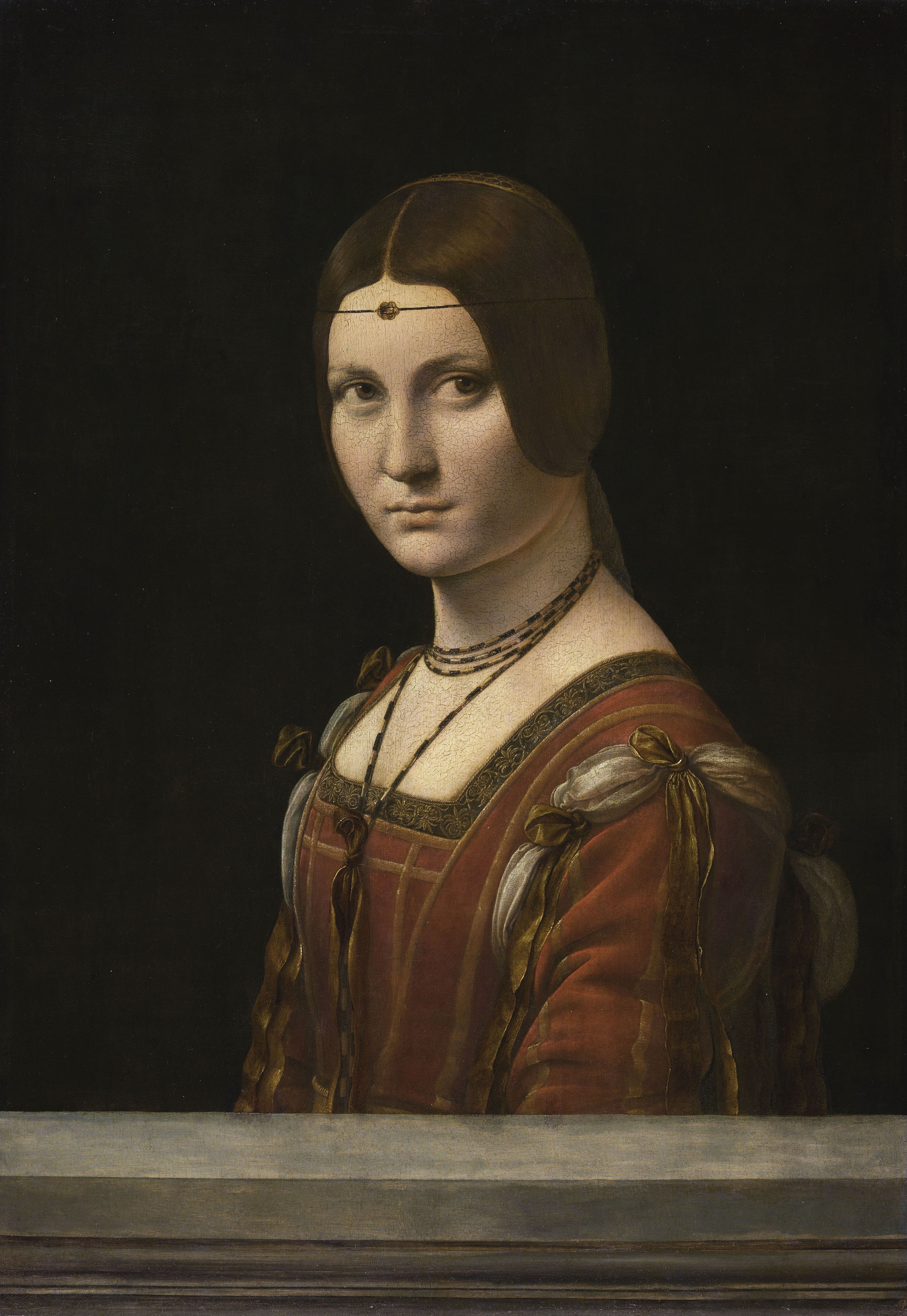
This work of art is obviously so famous that I couldn't really do it any meaningful justice in my own words. Instead I'll recount us actually seeing it in the flesh.
There were four of us—three Americans and myself—and we entered the painfully long queue to see the portrait up close. To pass the time we got quite rowdy entertaining ourselves, as did some of the other (non-Japanese) patrons. After a decent wait we took the first corner and actually got sight of the painting, albeit from a considerable distance. That moment was obviously special in its own right, but the queue continued ahead of us in a winding, snaking way akin to the immigration queues at LAX. We continued on with our conversations and eventually worked ourselves up with humour that I cannot share in this post. Once we had made it to within, say, five metres of the painting though, a universal and uncoordinated hush fell on us and the other patrons. We were within spitting distance of the unknown woman and it was nothing short of magical.
Once we had finally made it to the end of the queue and got to approach La Belle Ferronnière up close, I was completely and utterly entranced by it. Even a centimetre closer, the difference in detail is profound, and her gaze captures you immediately. The exact emotional profile of her face undulates back and forth as you stare at her, never quite certain as to what she is thinking or feeling.
89th Shinseisaku Art Exhibition 2026
A few days later, we went back to NACT to see the 89th Shinseisaku Art Exhibition. The first half consisted of sculptures only and whilst impressive, sculpture is not a medium that I am intimately familiar with. The latter half was where the paintings were and what follows are my favourites from this section.
たどりつくまで (Until I Get There)
たどりつくまで (Until I Get There) by 久保 貴美 (Kubo Kimi).
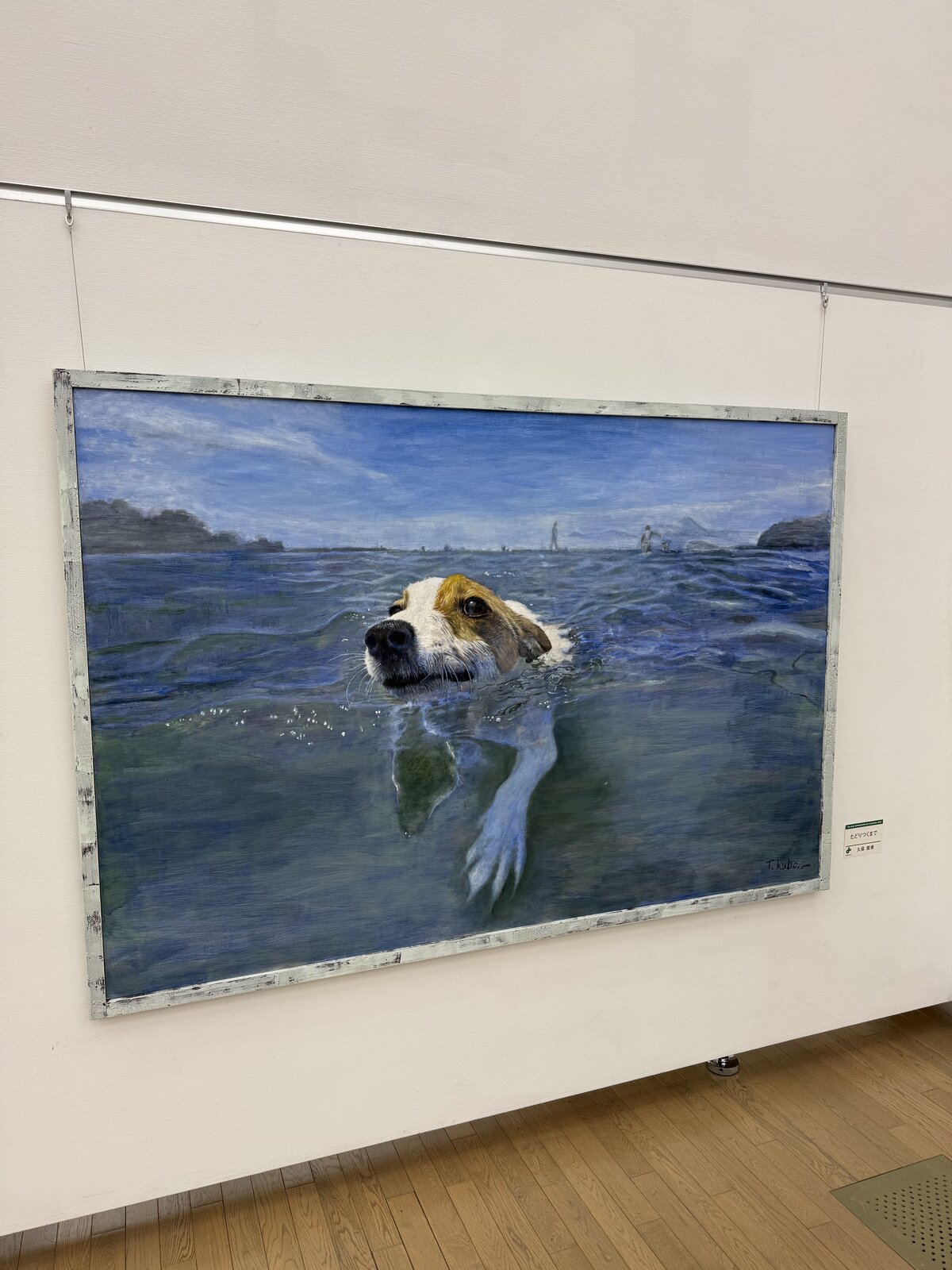
What's not to love here? What immediately stands out to me is both the perspective and the colour palette. The point-of-view perspective conveys a sense of joy and immersion while the blue-white colour palette emphasises the dog in the centre of the frame while obviously fitting the scene itself. I also love the dog's knowing smirk.
聖地峡流瀑 (Sacred Gorge Cascade)
聖地峡流瀑 (Sacred Gorge Cascade) by 畔上 房雄 (Azegami Fusao).
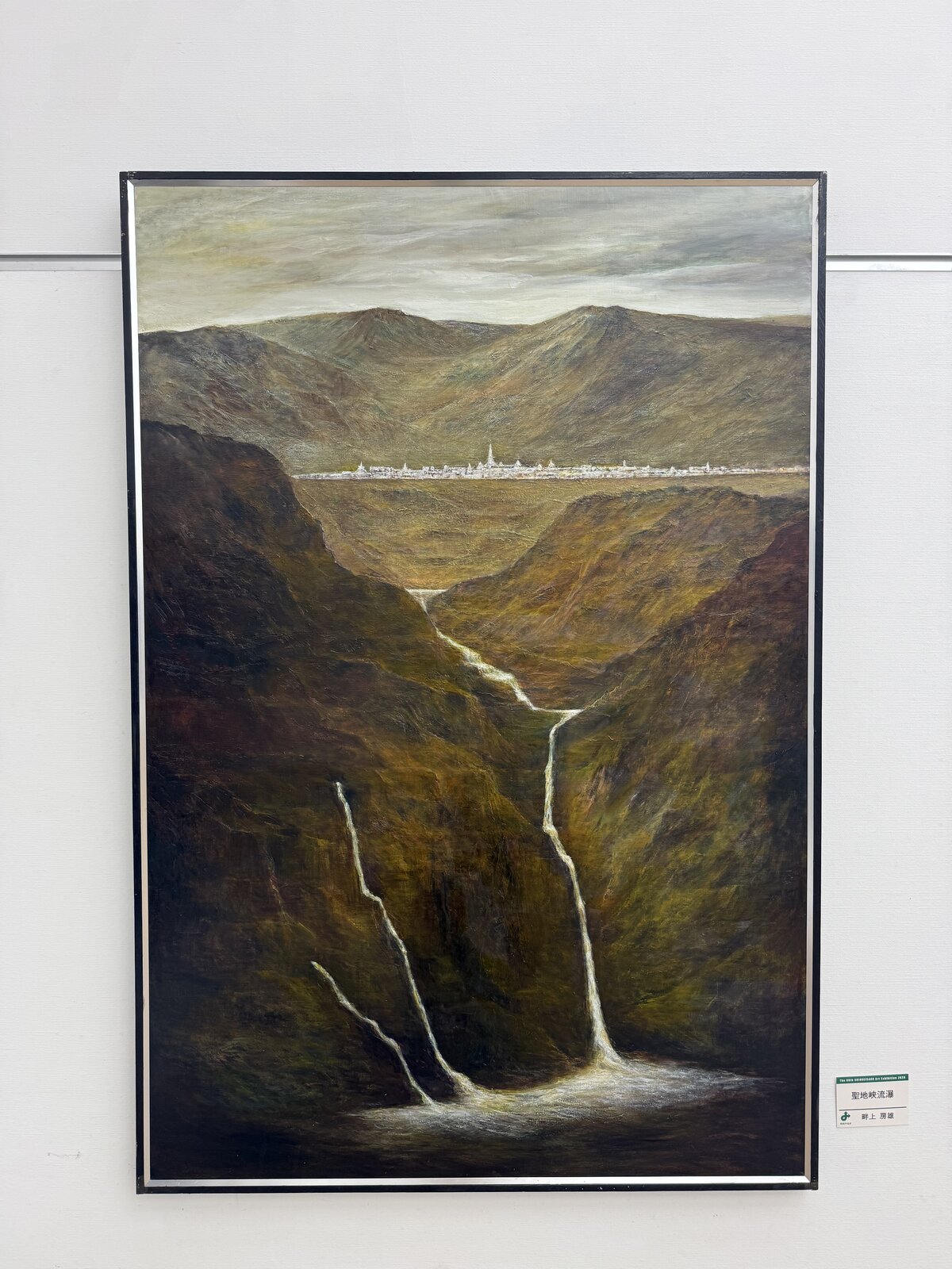
What I like about this piece is that it uses geometry to good effect: the water forms these janky, angular paths down the gorge while the city in the background is straight and flat. Again, the colour palette here is great. The muted tones throughout the entire scene dull the image just enough to capture the intended atmosphere. The grey skies above the deep orange-green mountainsides along the gorge are punctuated by the angular, white water in the foreground and the cityscape in the background.
夏の風景 (Summer Landscape)
夏の風景 (Summer Landscape) by 篠田 巧 (Shinoda Takumi).
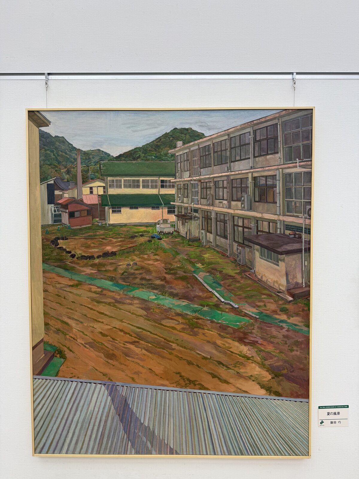
To me, this piece depicts a quintessentially Japanese scene and that's the crux of why I enjoy it so much. There's of course a solid use of colour and angles to frame the courtyard as well, but it really does come down to the actual content for me. The external AC units, the architecture, the downpipes, the agricultural elements, and the kei truck specifically.
わたしのVenezia Ⅱ (My Venezia II)
わたしのVenezia Ⅱ (My Venezia II) by 藤谷 万里子 (Fujitani Mariko).
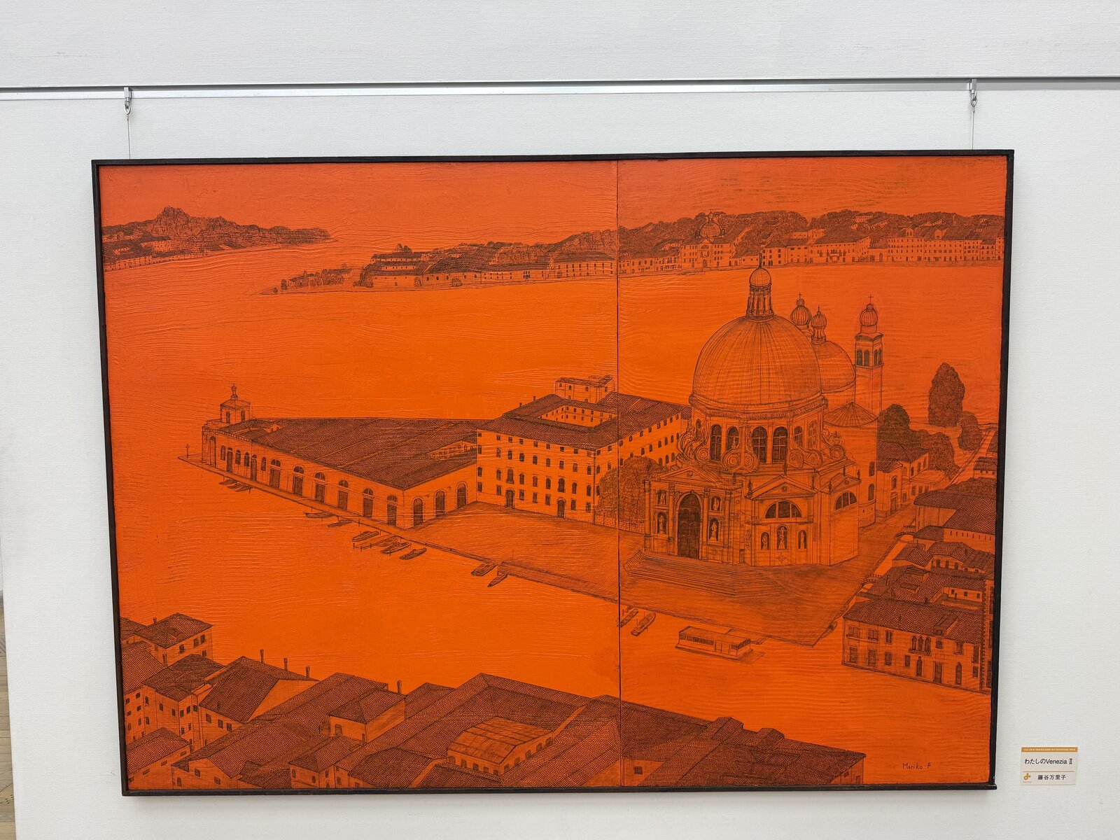
Obviously the most striking feature of this piece is the harsh orangescale colour of the entire thing. Any Venetian scene is of course fantastic to admire but this one in particular makes use of perspective to great effect in my opinion.
保元の乱 (The Hōgen Rebellion)
保元の乱 (The Hōgen Rebellion) by 田村 佳丈 (Tamura Yoshitake).
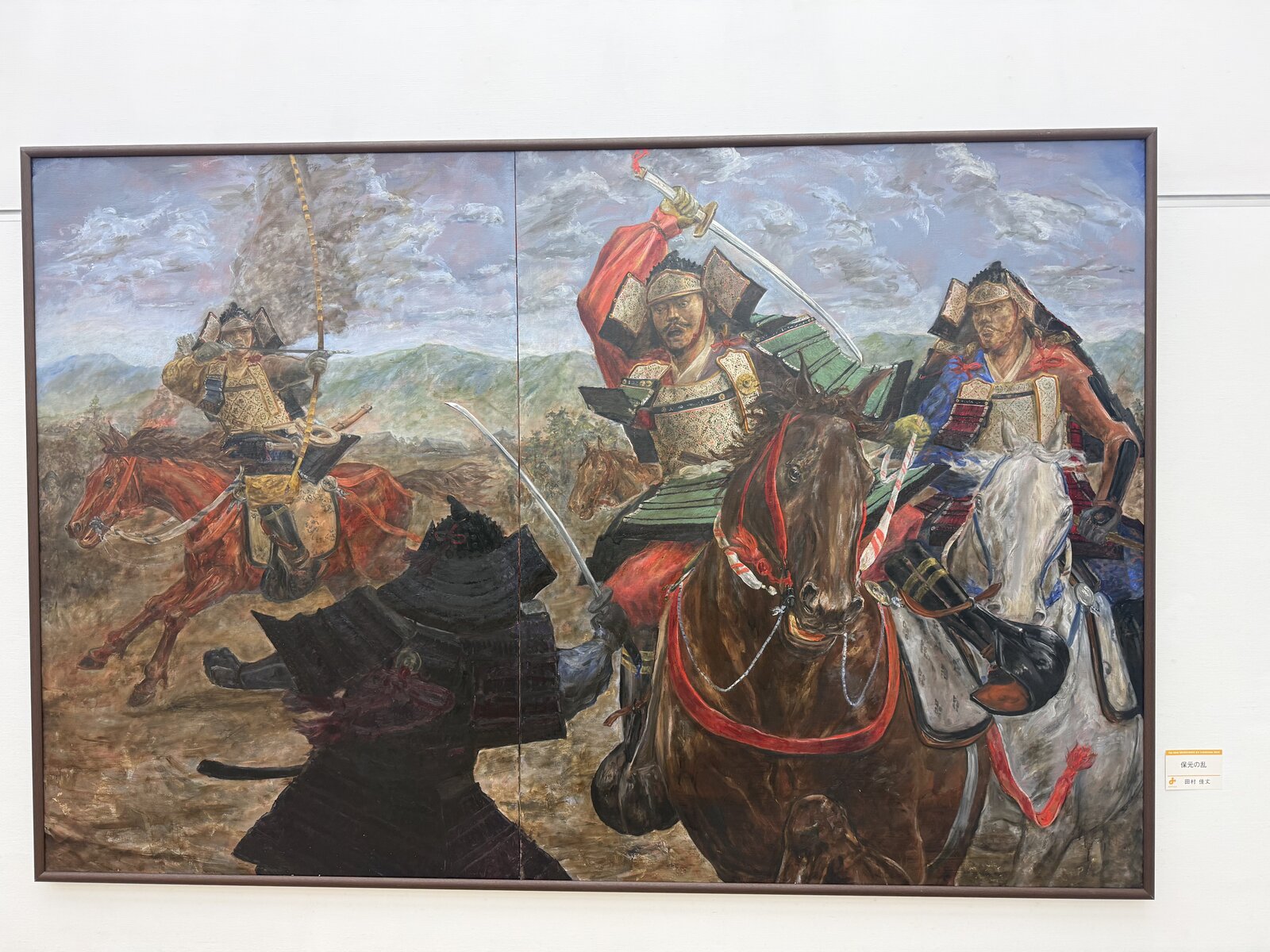
Honestly, it's difficult for me not to include a depiction of a battle if it's in an exhibition. They are obviously these extremely emotionally and spiritually charged events so the art depicting them (even if very plain) is bound to be stimulating.
In light of the above, I don't really have all that much to say on this one. The use of colour is again good, with the red horse being particularly striking visually. The facial expressions here convey the intensity of the actions being performed, even if somewhat plainly. The physical construction of this piece is also noteworthy I feel: it's just two canvases, but that gives it the vague impression of being a diptych2 which I found interesting.
橋梁のある風景 (Landscape with a Bridge)
橋梁のある風景 (Landscape with a Bridge) by 鶴山 好一 (Tsuruyama Koichi).
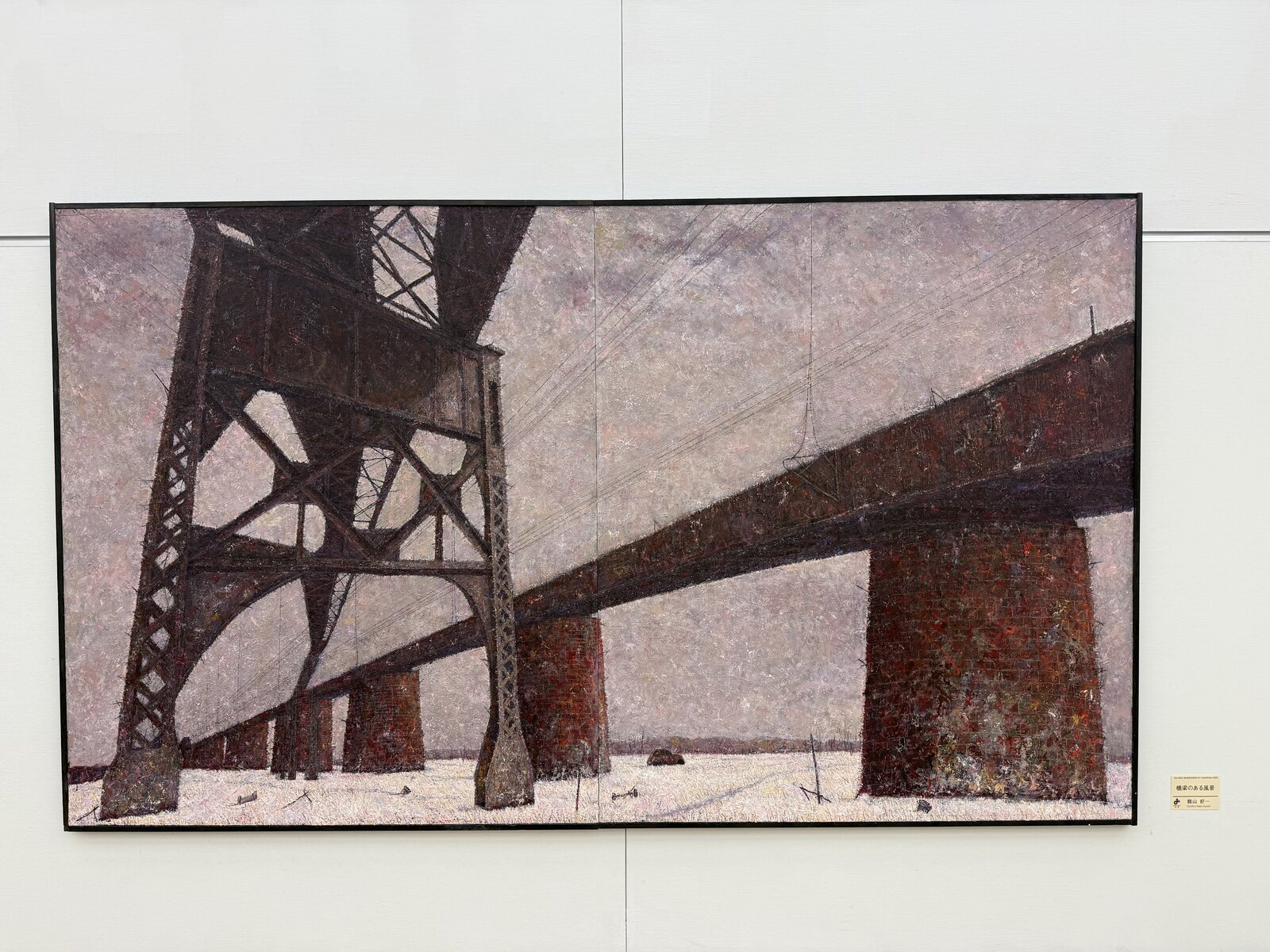
This painting struck me immediately because it is quintessentially Japanese but in a way that's completely unlike Summer Landscape above. It does share the rural environment with Summer Landscape though. The first time that I ever saw snow was in Japan and it had a fairly profound impact on me. During that ski trip, I had the fortune of getting to enjoy many similar landscapes at nighttime.
Visually, the vanishing point in the bottom left quadrant draws us as viewers into the vast abyssal realm that the painting is trying to capture. The mix of white, grey, and brown prime us to feel the uneasy dreariness of the scene. The use of shadows draws the eyes towards the finer aspects of the truss elements also. While it's not very faithfully captured by my iPhone photography, the brickwork on the overland railway is also quite intricate and comes across as such in the original piece. There's also the pareidolic effect of the truss on the left if you stare long enough.
塔のある回廊 (Corridor with a Tower)
塔のある回廊 (Corridor with a Tower) by 山口 都 (Yamaguchi Miyako).
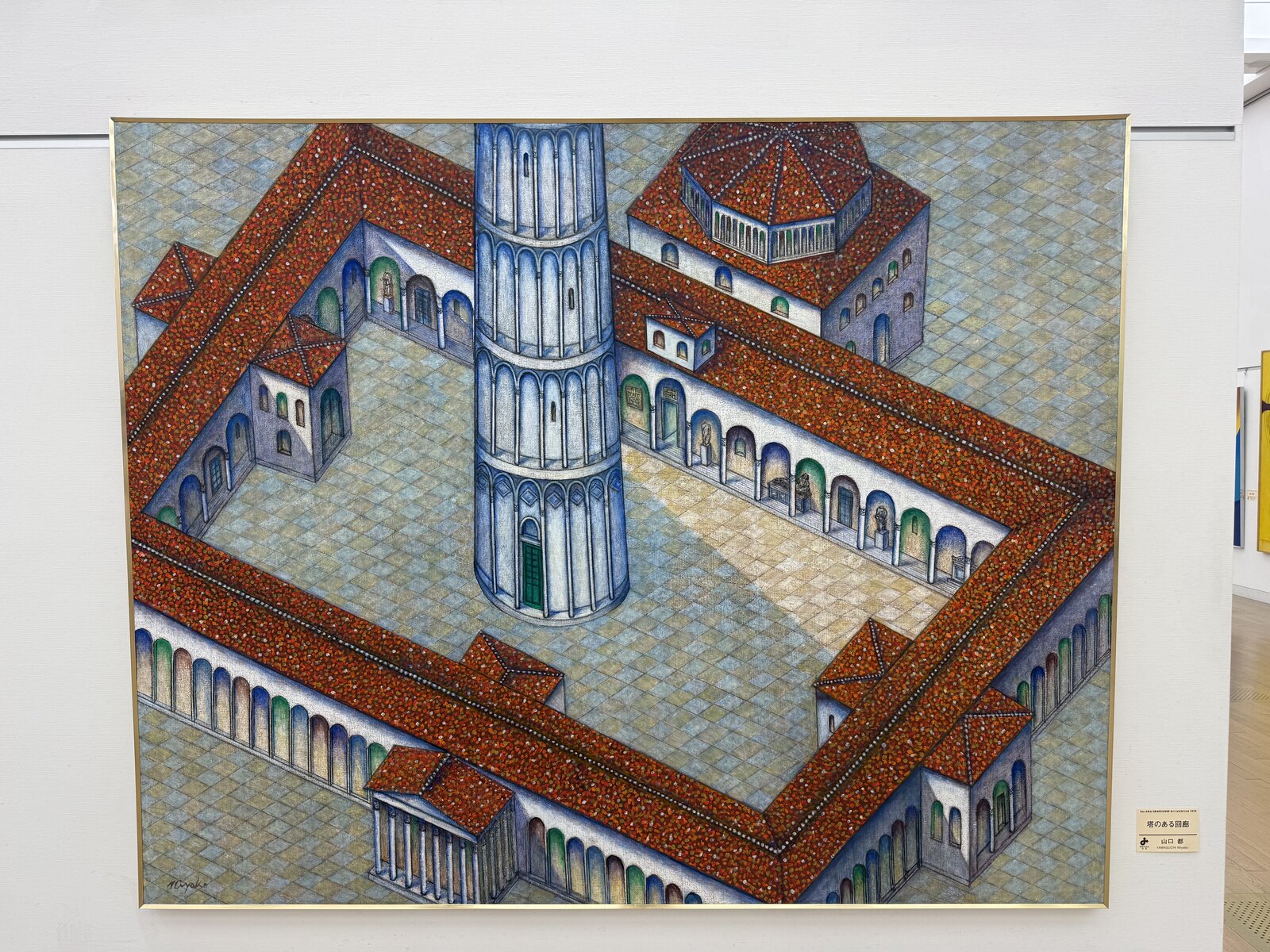
The two aspects that really shine in this one are perspective and detail. For the former, it's the sort of skew-isometric perspective of the courtyard. For the latter, it's the attention given to the arches and the rather intricate tiling on both the roof and the ground. It also helps that the content of this piece is very architecturally sound too.
城壁の街 (Walled Town)
城壁の街 (Walled Town) by 四宮 敏行 (Shinomiya Toshiyuki).
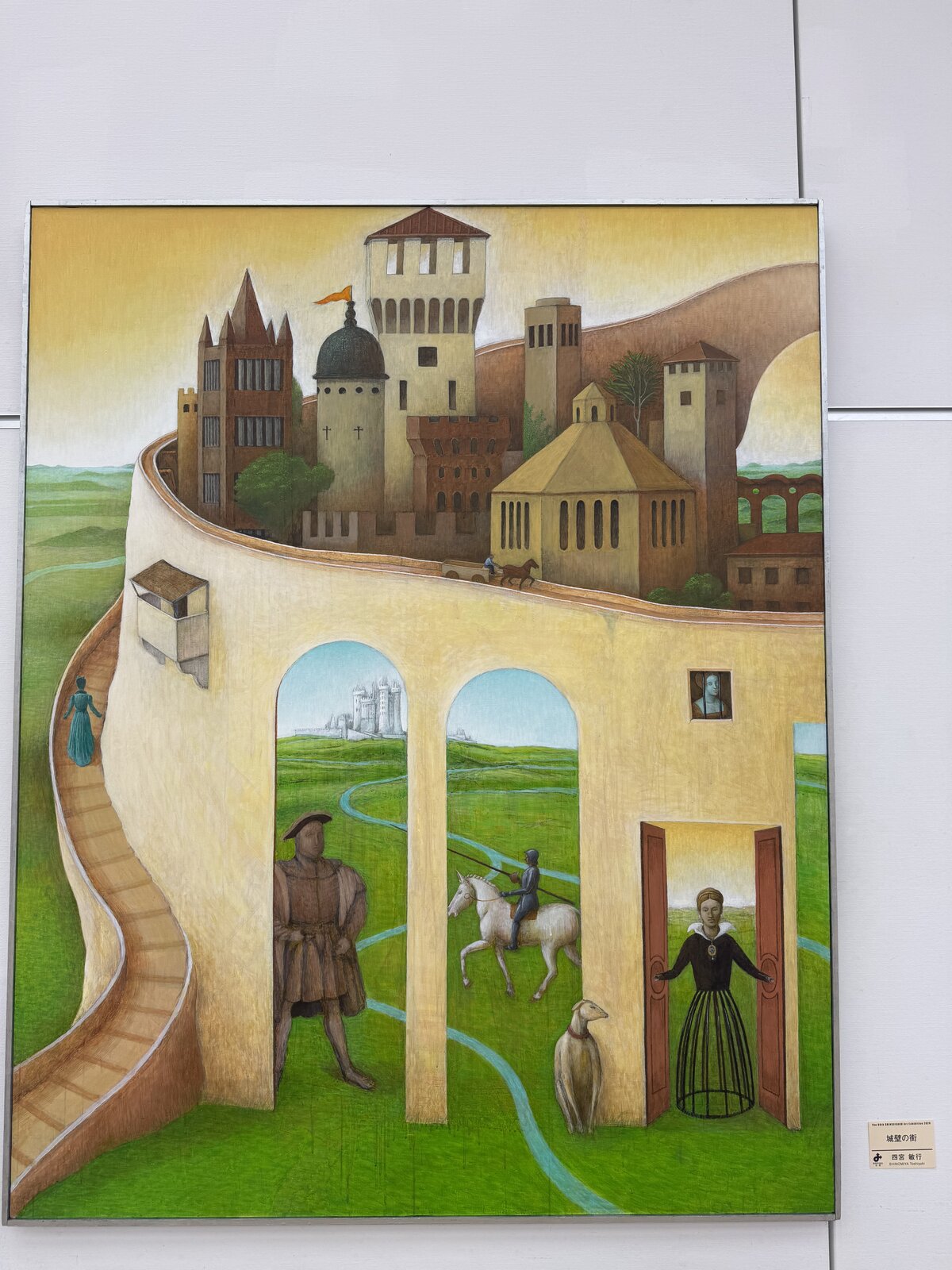
This piece immediately reminded me of a Hieronymus Bosch painting in both its composition and perspective. There are also figures in a rather bizarre arrangement interspersed throughout the foreground. From left to right we have an unknown woman traversing the staircase, Henry VIII in his signature power stance, a mounted knight preparing to joust (fittingly facing Henry VIII!), and most bizarrely of all a half-humanoid woman opening doors whilst facing the viewer directly. The colour is also handled rather well.
I became familiar with Kurokawa as he designed Central Plaza 1 in Brisbane. NACT was one of his last projects before his death.
My favourite painting is The Garden of Earthly Delights which is famously a triptych, so I'm always on the lookout for anything even vaguely similar.